Introduction
Web design is essentially creating user-friendly experiences. And in 2024, Bento Box grids are storming the industry. It’s inspired by the neatness of presentation that comes with Japanese lunch boxes, this layout style combines minimalism with functionality to offer clean and structured web experience.
What is a Bento Box Grid?
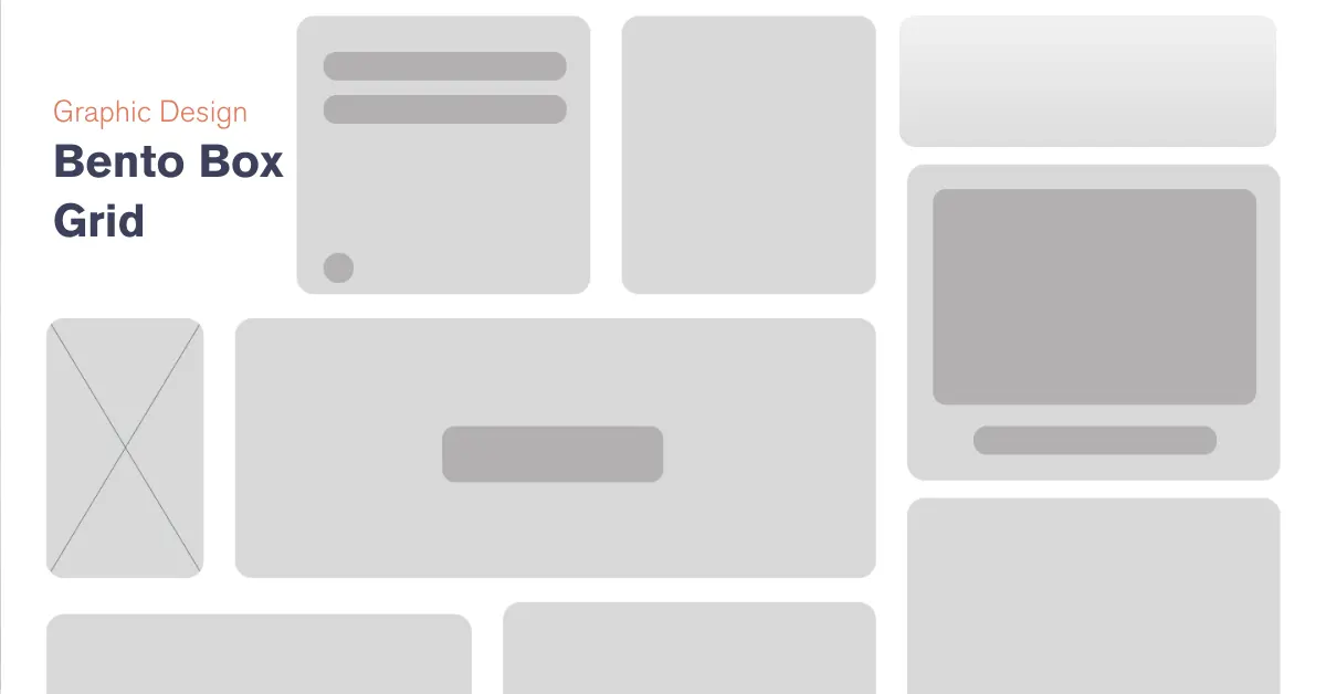
A Bento Box grid arranges elements of a website in compact modules, either square or rectangular, much like those found in a Japanese bento box. This system makes it easier to navigate and offers a visually pleasing, structured layout.
Why Bento Box Grids Are Trending
- Clean Aesthetics: Perfect for minimalist designs.
- Mobile-First Appeal: Highly adaptable to responsive layouts.
- Focus on Content: Reduces distractions, emphasizing key messages.
Key Elements of a Bento Box Grid Layout
- Grid-Based Structure: Divide the layout into proportional sections.
- Whitespace Utilization: Maintain balance and prevent clutter.
- Interactive Modules: Use hover effects and animations to enhance engagement.
Tools to Create Bento Box Grids
- Figma/Adobe XD: For wireframes and prototypes.
- Bootstrap/Grid Systems: For seamless development.
- CSS Grid/Flexbox: To create custom grid structures.
Benefits of Using Bento Box Grids
- Improved Navigation: Users can easily find the information they’re looking for.
- Faster Load Times: Simplified layouts often require fewer resources.
- Enhanced Visual Appeal: Perfectly aligned sections create a pleasing aesthetic.
Case Studies and Inspiration
- Apple: Known for its grid-based minimalist design.
- Portfolio Websites: Many designers use Bento Box grids to showcase work.
Step-by-Step Implementation Guide
- Sketch Your Layout: Plan out modules for text, images, and CTAs.
- Build the Grid: Use CSS Grid or Flexbox to create a flexible foundation.
- Test Across Devices: Ensure it’s responsive and user-friendly.
Conclusion
Bento Box grids are not just a design trend but more of a functional approach to modern web layouts. Implementing this style will allow you to provide users with streamlined experience while enhancing the visual appeal of your website.
3D Hyper-Surrealism in Graphic Design: A Complete Guide to Trendy Visuals
Exploring Biophilic Design: Bringing Nature into Our Built Environments


